


POWERFEST
The task was to introduce a fresh concept to the already well-established POWERFEST brand. Another designer and I collaborated on this initiative, presenting our respective ideas to the stakeholders, who ultimately selected my concept.
My approach involved retaining the original belt but infusing it with a new twist by incorporating a poker chip. I replicated the existing font and effect to maintain continuity with the previous logo, while also integrating textures and lighting to add a realistic touch.
Previous Design
Initial Design
Final Concept
In Action
It was a requirement that the promotion could be effectively presented both digitally and in print. As a result, I focused on creating a versatile design that could seamlessly function across both platforms.
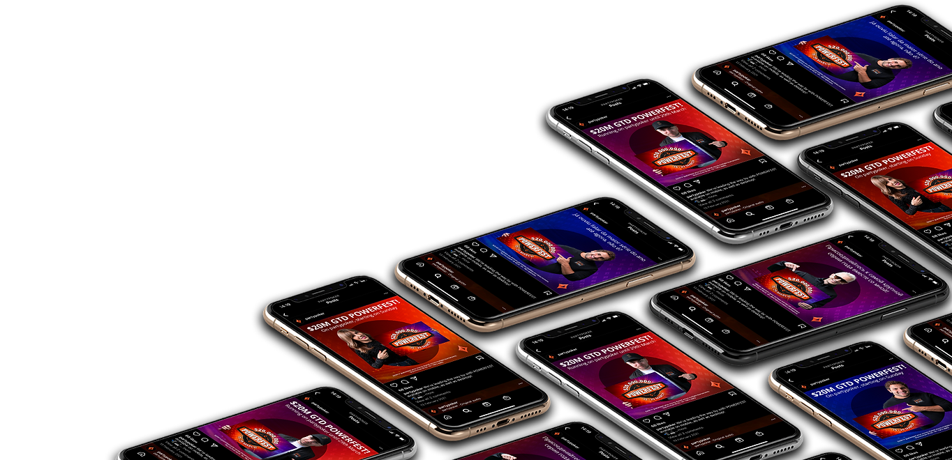
Social Assets
As part of the rebranding effort, I also developed new social assets to accompany the tournament, ensuring that the promotion reached the intended audience through compelling posts, including participation from prominent poker professionals engaging with the logo.


